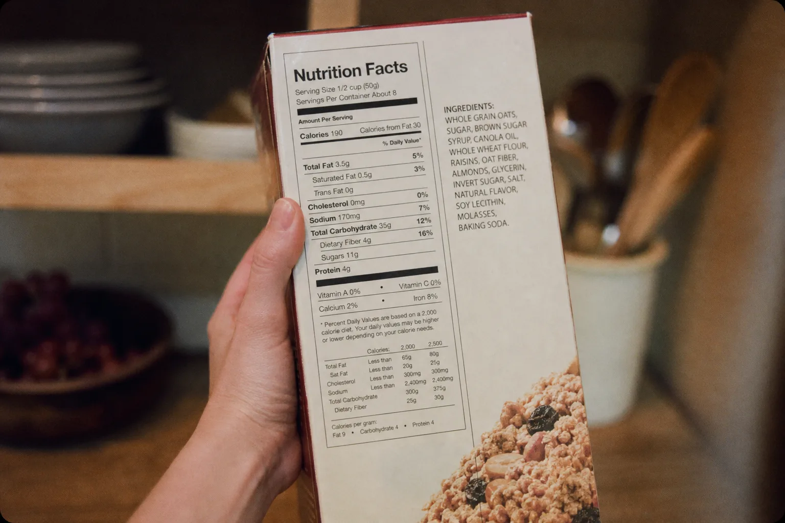
Pick up any boxed food and read the front, then read the back, and notice that they are written by people working under different constraints. The front says wholesome, made with real fruit, a good source of fiber, and supports a healthy heart. The back says almost nothing except numbers and a list. That difference is not a marketing decision about tone. It is the visible edge of a labeling system assembled in layers over decades, where each layer left behind a category of wording with its own rules and its own level of proof.
The Layers, in the Order They Arrived
The oldest layer is simply the requirement not to be false or misleading, which sounds comprehensive and is in practice a floor rather than a standard. The second layer is the ingredient list and the identity of the food, which is why certain products have names that seem oddly specific and why others cannot use a name at all unless they meet a standard recipe. The third layer is the nutrition panel, which arrived with mandatory disclosure and standardized serving sizes.
The fourth is nutrient content claims, meaning phrases like low fat, good source, and reduced sodium, each of which has a numerical definition attached to it. The fifth is health claims connecting a nutrient to a disease, which require authorization and prescribed wording. Every one of those layers still operates, which is why a single package can carry a legally defined term, an unregulated adjective, and a rigidly worded health statement within four inches of each other.
Why the Phrasing Sounds the Way It Does
The stilted quality of certain sentences is the most reliable signal on any package, because a phrase that reads awkwardly has almost always been constructed to fit a rule. Wording that says diets low in saturated fat and cholesterol may reduce the risk of heart disease is written that way because the permitted form of that claim requires the qualifier, the conditional, and the reference to the whole diet rather than to the product. Nobody in marketing would have chosen that sentence.
Conversely, a phrase that reads smoothly and says something appealing is usually operating outside any defined category. Wholesome, artisan, farm fresh, and inspired by have no regulatory definition, which is precisely why they are attractive to use. The general prohibition on being misleading still applies to them, and it is a much weaker constraint than a numerical threshold, since misleading has to be argued while a milligram figure simply is or is not met.
Which Terms Are Actually Defined and Which Are Not
Defined, with numbers behind them: low fat, fat free, low sodium, light in the nutritional sense, good source, excellent source, high, reduced, lean, and healthy. Each has a threshold expressed per serving, which is what makes them checkable and also what makes serving size such an important number. A product achieving low sodium on a serving nobody actually eats has met the definition honestly and communicated something untrue, and that gap is legal. Not defined, and doing most of the persuasive work: natural, which has no formal definition for most foods and is the single most contested word on any label. Artisan, wholesome, pure, premium, and simple, none of which mean anything specific. Made with real fruit, which requires the presence of fruit rather than any particular quantity of it. And free range and similar production terms, which carry definitions in some categories and considerably looser meanings in others.
Serving Size, Which Quietly Governs Every Number Above It
Every figure on the nutrition panel is expressed per serving, which makes the serving size the most consequential number on the label and the one shoppers read last if at all. A beverage container that holds two and a half servings reports calories, sugar, and sodium at forty percent of what somebody drinking the whole thing consumes, and the arithmetic is entirely disclosed and entirely easy to miss. Products that were reformulated to hit a nutrient threshold sometimes did it by adjusting the serving rather than the recipe.
The revision that added a per-container column to many labels was aimed squarely at this, and it helps where it appears. Where it does not, the habit worth building is to look at the servings per container line before anything else and multiply if the answer is not one. It takes three seconds and it is the difference between reading the label and reading a fraction of it.
The Front and the Back Are Governed Differently
The nutrition panel and the ingredient list are prescribed in format and content, which is why they look identical across every product on the shelf. Ingredients appear in descending order by weight, which is the single most useful fact a shopper can hold, since it tells you what the product is mostly made of regardless of what the front says. Anything appearing after the seventh or eighth ingredient is present in small quantity, and anything appearing after the phrase contains two percent or less of is present in a trace amount.
Two conventions inside that list are worth knowing because they change what the order means. Sugars appear under a great many names, and a product using four of them can list each separately so that none reaches the top of the order even though sugar collectively would. Compound ingredients are broken out in parentheses, so a sauce or a seasoning blend appears as one item with its own list inside it, which is where a substantial share of the sodium in prepared food usually lives.
The front of a package is advertising, and advertising is where a second regulator becomes relevant. The Federal Trade Commission is the agency a competitor would go to over an advertising claim that outruns its evidence, and the standard applied there is whether the net impression on an ordinary consumer is substantiated. That is a different and broader question than whether any individual sentence is technically accurate, which is why a package can be entirely truthful line by line and still be the subject of a complaint.
What Has Changed Recently, and What It Fixed
The nutrition panel was revised to make calories more prominent, to update serving sizes so they reflect what people actually eat rather than what they were once advised to, and to add a line for added sugars separate from total sugars. That last change was the most consequential, because it answered a question the old panel structurally could not: whether the sugar in a product came with the fruit or arrived in a truck.
A quick read of a package can therefore be done in about twenty seconds and in a specific order. Serving size first, because every other number on the panel depends on it. Then the first five ingredients, which tell you what the food is. Then added sugars and sodium, which are the two figures most likely to be surprising. The front of the box is read last, and largely as a guide to what the manufacturer wanted you to notice rather than as information about the food inside it.